
In preparation for Global Accessibility Awareness Day, the Guardian Accessibility Working Group decided to run a workshop for our colleagues.
Our aim was to talk about digital accessibility, and how it can be considered part of universal design. We wanted to explain the importance of these two concepts, while also getting our colleagues to try out some digital accessibility tools!
Format:
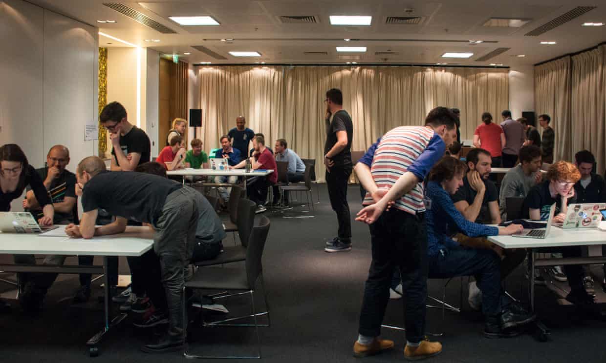
We had four stations, each one facilitated by a member of the Accessibility Working Group, and focusing on a different accessibility consideration, or tool. As our colleagues arrived, we asked them to choose a group. Once the interactive part of the workshop began, the groups would spend 10 minutes at each station before rotating to the next one.
During each rotation, we encouraged discussion while the challenges were being attempted. These tasks were designed to be hard, to bring home some of the frustrations users may have.
Screenreaders:
To highlight the importance of decent semantic structure and ARIA labelling, one challenge required attendees to fill in and submit a short survey, while receiving minimal visual feedback. To help with the challenge, we introduced VoiceOver; the screen reader for MacOS, and provided some cheatsheets of keyboard shortcuts for browser navigation with VoiceOver.
Our survey was built upon on the fantastic work of Laura Carvajal that she presented at London Web Standards in March 2017. Visual information was restricted by applying css styling to blur the webpage.
When users submitted the form, the page would update to inform them whether it was successful, or if they had missed a required field. Unfortunately there was no audible notification for these states, so our attendees were always uncertain if they had completed the challenge!
After frustrating everyone with an inaccessible survey, we tried out our own homepage (with a strong blur filter applied), to see what it sounded like with a screen reader, and if we could navigate to the main content.
No mouse:
No-mouse navigation is one of the easier to implement, and more commonly used ways of accessing a website. Uses range from people with motor function issues to visual impairment to temporary problems such as injuring your dominant hand.
The challenge at this table was to fill out a survey on the w3.org site which has been purposefully sabotaged to be as frustrating as possible to fill in. This means changing the order that moving through the elements on the page would logically follow, removing highlights from currently selected items and not giving good feedback on errors and inputs. The teams quickly found the form unworkable, taking far longer than needed to fill out the survey.
Luckily, as the input comes from a common source, the keyboard, support for no-mouse navigation is well covered in software, including web browsers. The solution to a lot of the problems encountered in this challenge was to let the browser act as it should, ordering things correctly in the page and leaving the highlights alone, or ensuring you replace them when they’re removed.
These are seemingly tiny things, but make a world of difference to anyone that relies on them.
Colour blindness:
Use of colour is integral to the design, branding and identity of a website, but it has important implications for readability and user experience. There are many examples on the web of user journeys and infographics that rely solely on the use of colour to distinguish data or signify calls to action, from buttons to election graphs to football team form charts. By not providing enough colour contrast, we may render text or forms inaccessible.
To simulate colour blindness and visual impairment, we asked participants to install the NoCoffee Chrome Extension. We then asked them to complete a series of exercises, such as interpreting election results and buying packs of t-shirts. We found that in some cases it’s difficult or even impossible to navigate a shopping journey or discover hyperlinks without the ability to differentiate between certain colours. An awareness of this fact will help us make the user experiences we design more accessible.
Voice navigation:
Very much like keyboard navigation, voice navigation can easily get the user lost on a page if the developers do not use the right fields, or use strange tab orders. Voice navigation can be a slow process because it takes ages to understand. Therefore it is important to make the amount of steps to content as few as possible, and make undoing mistakes easy.
To let our colleagues try out voice navigation, we set up a Macbook with dictation enabled and used a standing microphone to input commands, to counteract the background noise of the workshop!
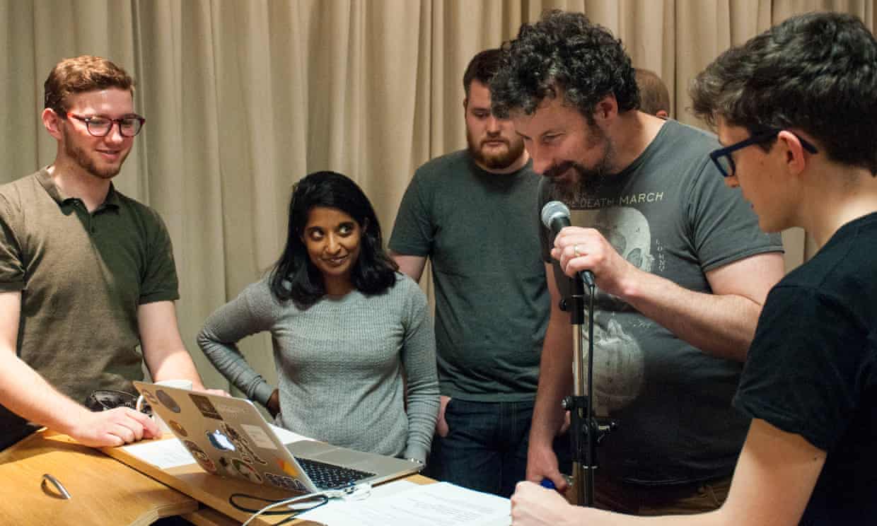
Conclusion:
After giving everyone some time at each station, we wrapped up with a Q&A.
People showed a renewed interest in accessibility considerations, and how it impacts their day to day work. As well as our external facing products, the Q&A generated a lot of discussion about the accessibility requirements of our internal products.
What next:
The goal of this workshop was not to transform everyone into accessibility experts; there are far too many considerations! However, we hope that the sessions helped our colleagues to get an understanding as to how people use these tools online, and the potential issues and annoyances that occur online, when accessibility isn’t considered.
We would like to start resolving some of our existing problems, so that we can easily monitor newly introduced problems later on. A recent addition to the codebase of the main website is the introduction of Pa11y - a tool that can be used for automated accessibility testing.
The Guardian Accessibility Working Group believe that by discussing and championing accessibility, we can all become more mindful when designing, building and refactoring features in our digital products.