Last year at the Guardian we sent over 40 million editorial emails. The Fiver, Guardian Today, and Media Briefing are amongst our most popular, but we have others from a range of editorial desks. Late last year, a project team started work on refining our email products. As the user experience architect on the project, here’s my take on what we did.
Why does our current stock of emails need to change? What issues were we addressing? Our most popular news email is the Guardian Today. Before this project, the email was “scraped” from our front page, which isn’t optimised for mobile devices by design. Viewing it on a phone is an awful experience, with pinching and zooming the only sensible way of viewing on a mobile device. Not good. From the outset, this project was tasked with producing a mobile-optimised design, as all the trends point towards email being the dominant platform real soon now. We’re designing for that, as well as supporting desktop – it’s still a popular platform, after all.
The project also aimed to increase the number of people opening the emails, and then clicking through onto a Guardian article. We have an advertising supported model, so we need to be mindful of this goal in everything we do.
In order to better design for our users early in the project, we set out to understand how they felt about email in a set of workshops. The workshops were fascinating: we learned what our users thought of the emails they currently received, when they tended to read their mail, and where they read their email. It backed up our assumptions from studying the analytics.
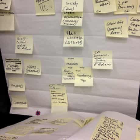
We asked our workshoppers to “design their own email”. The task resulted in some fascinating insights:
- In a daily email, the majority of our users requested a morning delivery containing news-focussed content. Some would like to customise the delivery time.
- A weekly email should contain cultural and life and style pieces , technology articles and ‘best of’. All to be delivered on a Friday afternoon in order to help people to plan their weekends – ideally using a location to provide relevant recommendations.
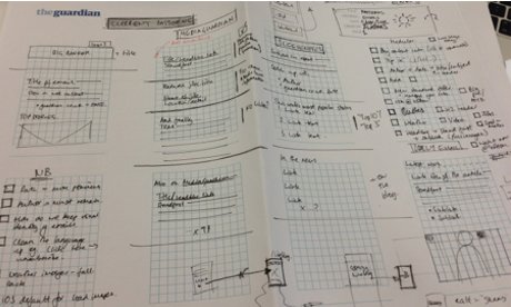
The results from the workshop suggested that the following sections would perform well in a simplified design: top news stories/editor’s picks; most popular for the previous 24 hours; Eyewitness photo of the day; sport; and culture stories.
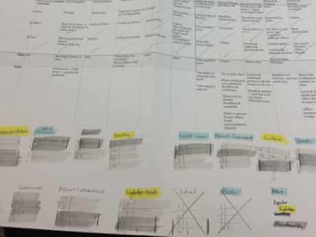
Working together with Akemi Takagi – the team’s visual designer – we established what patterns or content structure our current emails contain. Current patterns include picture + stand first + links, bulleted lists, copy section, large picture et cetera.
Working towards a mobile-optimised design meant we could leverage the excellent work from the new m.guardian.co.uk. Akemi ensured that the designs scaled up to desktop-width emails, which is a 600 pixel maximum by convention.
So, how has it gone? We’re fans of measuring change, and we sent our first split test email last week: half of the subscribers received the old; the other half the new template. There are two ways we’re going to understand the impact. Email we send has a tracking code attached, so we can tell when a link in an email is opened, and when a link has been clicked (there are some exceptions). These codes are immensely helpful to us for understanding how our emails perform in the real world, using a large sample size.
The initial numbers are positive. We’ve seen a small uptick in click-through rates in the new email, and this is before optimisation based on user feedback – it’s encouraging. We received over 140 emails about the change, and the feedback fell into three categories: “give us more content”; “give us the trail text” (the 15-25 word summary below the headline); and “there’s too much scrolling”.
We’re in the process of updating the daily email in response to that feedback. We know what our end result looks like, and we’re going to iterate to the ‘final’ result, making a single change at a time to understand the impact each one has. If a change has a negative impact on traffic back to the site, we have to carefully consider both the effect of the change for users, and also the traffic implications.
Over the next few weeks, we’ll be moving more of our emails to the new format, so take a look at our offerings, and maybe come on the journey with us. And send us feedback, because we do listen.