
If you’re a regular Guardian reader, you might have visited our new website without knowing it. We’ve rebuilt it using React and Typescript and whilst it looks pretty similar to our old website, what’s underneath is all new.
We’re currently running a beta test where we send roughly 1% of our audience to the new website. An exception to this test is the page that you’re on right now. We changed the filter algorithm to ensure 100% of page views for this particular article are served by the new platform. You can confirm this by scrolling to the very bottom of the page where it says beta at the end of the copyright note.
We’ve previously written about the problems we have with our existing site and how this led us to make the decision to start the Dotcom Rendering (DCR) project. But avoiding repeating these issues is not as simple as just deciding to use React and expecting that to make everything better. React gives you the tools to build bite-sized, encapsulated components, like a button, or a headline, and then helps you to compose them all together to create complex applications. But deciding what bitesized actually means or what language to use when composing them is not easy.
What’s in a box
Choosing what should be a component or not can initially seem obvious, I’ve been guilty of looking at a page and blithely drawing boxes around things whilst using the word just a lot. But it’s often only after you’ve built components and then tried to scale up their use, that problems arise.
To deal with this issue, we iterate. We build components to a level where they work – they render correctly – and then we look to get feedback from the team via pull requests (PRs).
After that, we continue to refactor as we start to use the component or sometimes simply after spending some time thinking about it. Some of the things that we consider when looking at a component are:
-
Naming convention: having the correct lexicon is important and famously difficult. There is often a strong temptation for developers to name it how they see. However, it is much more useful if we use the established lexicon of the company. We might look at the text that sometimes appears at the start of a headline and call it a prefix, but its correct name in journalistic terms is a kicker.
-
The api: what props to use and how to structure them is a core part of how a component is defined. This is an area that often gets refactored – we’re looking for props that are semantic and easy to understand.
-
Correct size: there are no agreed rules for when a component is too big, but a good rule of thumb is to imagine yourself as a new developer to the team and how you might feel opening up that file.
The headline is a good example. It started life as a simple h1 tag with some styles sitting inline inside a larger component. This worked really well and was production code for a long time. Later, as we needed to move things around to support different layouts, the h1 tag got upgraded to a component, but a very simple one that rendered a string using some styling. Later, we started to think about adding support for other article types and at this point we decided to take stock.
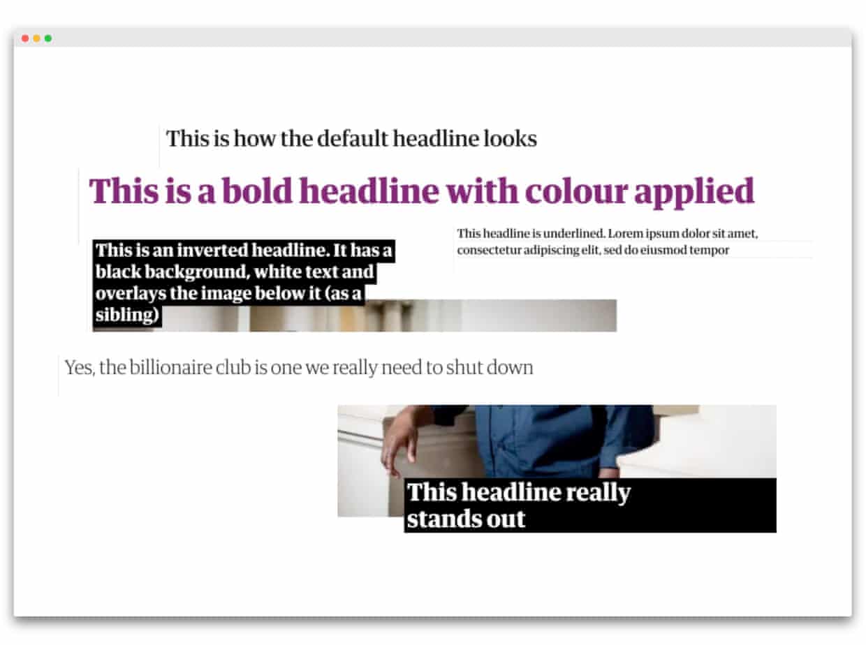
There are six variations for a headline – sometimes it has a colour, sometimes it’s big and bold – and sometimes it’s underlined or inverted. Finally, it can just be a headline, the default view. Knowing this, we built out the different styles and created a new api for our new and improved component. This way we could tell our component what type of headline to render, we gave each different version a name and created a special type property.
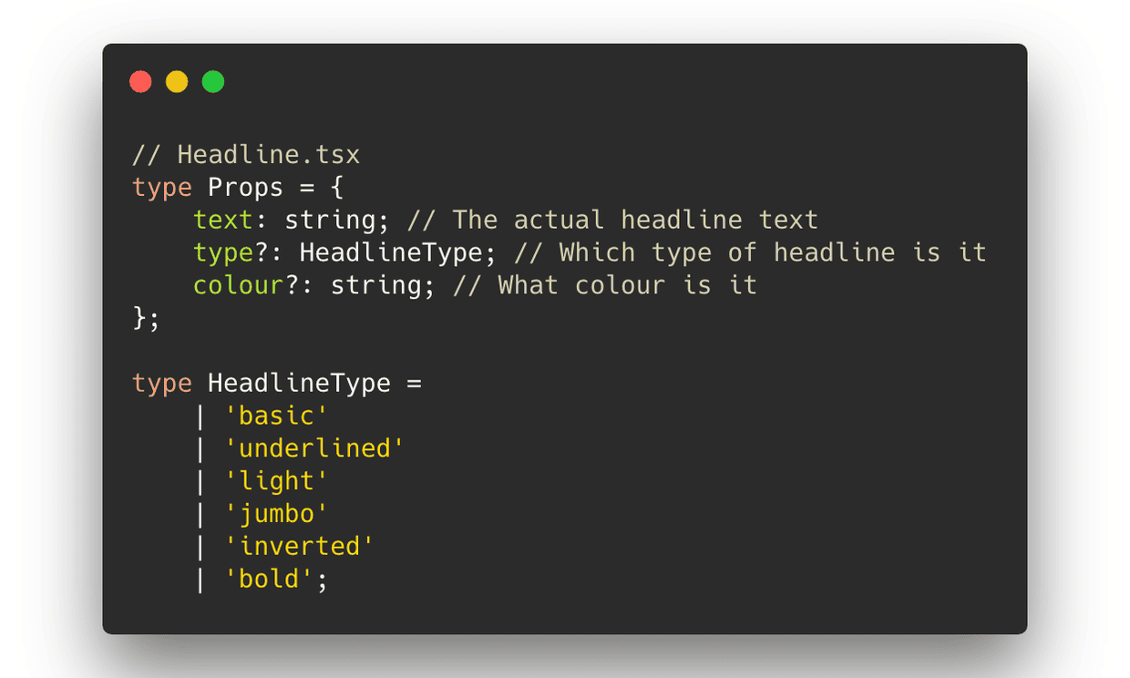
That api worked well if you understood when these different types should be used, which we did because we’d done the research, but it’s not reasonable to expect future developers to know this. I’m not even sure I would remember it all in six months time. So instead, we refactored the api to accept the properties that actually drive the choice for how it looks, rather than describe it. In this case it’s designType and pillar.
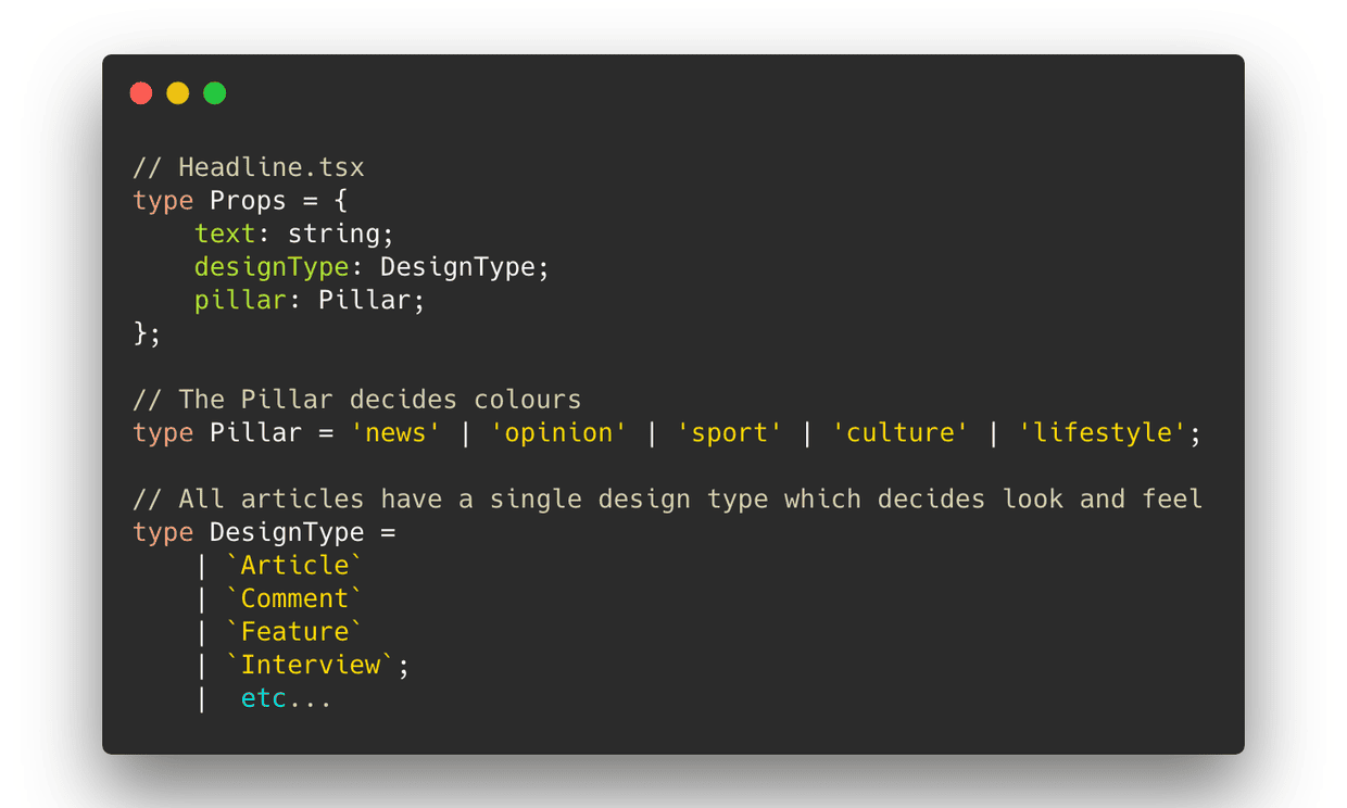
From this we can pass into the Headline component the editorial properties of what section (pillar) we’re in and what type of article we are (designType). Based on this, the component itself decides the correct style of headline to use. It’s clear, testable, easy for future developers to reason about and, we hope, scalable.
Making DCR fun
We want working on the DCR platform to be a pleasure. This motivation runs throughout the team, underscoring the work we do.
New developers joining the project are normally able to have the code up and running locally within five minutes, sometimes making their first PR the same day. We use a makefile to abstract common tasks giving new developers a simple, clear api with everything documented in one place. We use production articles for all development work so we don’t have to worry about test data and, not counting CI, we only have one test environment, and it’s optional.
Testing is critical but it shouldn’t be a chore. The Guardian’s website is mostly made up of static content with limited interaction, so when we think about testing we’re mainly concerned with appearance. Because of this, we’re light on unit tests and instead use a combination of live end to end integration tests and mocked visual snapshots to give us confidence when we ship changes to production (which we do for every PR).
We use Storybook to build components in isolation. This approach lets us visualise the component, test it using a wide range of props and then push the component code into production without it ever actually being loaded onto a page. Our Storybook library has lots of examples of components, like Headline, that are mocked up to show how they would look in a page but that often sit unused for a long time. When we do use them, it’s an easy, low risk experience, which makes developers happy.
If you want to learn more about DCR, have a look at our code. You can also opt in to our beta program by clicking here – after clicking that link, whenever you browse a page that is supported by DCR, you’ll automatically be placed in the test cohort and get the new version. If you think you’ve spotted a problem feel free to raise it with us here.