
Throughout the UK riots, many scanned the internet in search of reliable information. In the absence of confirmed news, the web was often the only way of tracking events. Amidst the hubbub, countless topics came and went. As worries mounted, speculation grew. Rare individuals requested sources, countered hearsay, sought the truth. The rise and fall of rumours on Twitter is a striking display of social forces in action.
Asked to produce an interactive visualisation for the Reading the Riots project, we resolved to find a way to show the birth and death of rumours on Twitter. The result is one of the most ambitious pieces we have ever built, both in terms of data analysis and dynamic graphics. It’s purpose: to display how misinformation corrects itself in open, unregulated forums.
Our initial source was a corpus of 2.6 million tweets provided by Twitter, all of
which ‘related to’ the riots by virtue of containing at least one of a series of hashtags.
The first challenge was to work out which rumours we should track, and how to isolate tweets that related to these rumours. Working in conjunction with journalists who’d covered the story, we identified 7 key rumours, ranging from the frivolous - that army tanks had been deployed in the City of London - to the more sobering - that the Tottenham riots began with the police beating a 16-year-old girl.
With help from an interdisciplinary team of researchers at the Universities of Manchester, St Andrews and Leicester, we distilled the overall corpus down to a series of subsets related to each rumour. We then undertook a more hands-on approach to find the tweets that best represented each story.
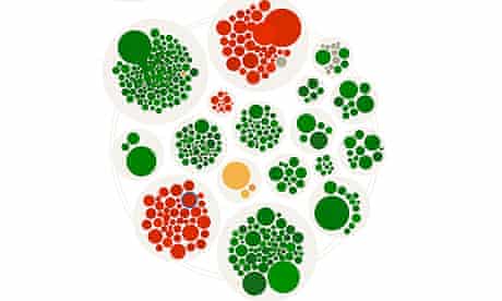
Next came the task of visualising the ‘flow’ of a particular rumour as it took flight. Looking to projects like Bloom’s Fizz for inspiration, we decided upon an aesthetic that shows tweets as circles grouped into larger circles. In our case, this grouping would place the items into clusters - each comprising a set of retweets for a given tweet.
To make this work, we needed to find which tweets belong to each cluster. Again, our academic partners proved invaluable, providing a parametrized Levenshtein distance algorithm for finding all tweets within a certain “distance” from each other in textual terms.
Once the clusters were identified, we developed a system to visualize their rise and fall over time. Sizing each tweet according to the influence of its author (determined by follower count), we added a decay function that would allow it to dissipate over time. As such, clusters grow and shrink as their theme is taken up by additional voices.
Our last challenge was to classify each tweet according to a ‘common sense
understanding’ of its main role as a communicative act. Did it support, oppose, query or comment on a rumour? In addition to an algorithmic analysis by our academic partners, each tweet was independently coded by three sociology PhD students in order to enable us to check for reliability. All the results were then subject to final review for quality assurance purposes. These categories could then be used to colour code each tweet so that readers get an overall picture of what direction the dialogue is taking.
With this work underway, developers Martin Shuttleworth and Robin Beitra built an interactive timeline that would allow each rumour to be replayed like a video. Getting such complex graphics in place using web standards poses many problems. After seeking advice from some experienced friends, we chose an architecture that resembles what you’d find under the hood of an arcade game. The data for each rumour is loaded from a JSON file and placed in a structured model. Every frame, the model is queried to find what’s in play, a custom physics engine is updated to reflect the results and a renderer draws the current state to the screen.
Robin went to pains to ensure we could cater for the largest possible audience. He built alternative renderers for WebGL, HTML5 Canvas and Flash so that even older browsers would have access. He then fine tuned the amount of information passed to the renderer so that it just draws what has changed rather than rebuilding the whole scene each frame.
Martin did some great work to make an interactive playhead that lets the rest of the system what time it is. Backbone.js proved very useful for keeping everything in sync. We added a graph of tweet volume over time to help people find the most interesting parts of the story. This is drawn in SVG or VML depending on browser capability.
Finally we attempted to trace the narrative arc of each story with a series of editorially curated panels, each of which cites a key tweet (or tweets) from within the life of the rumour. This adds helpful context to what might otherwise be a somewhat abstract journey.
We’re pretty happy with the result. The combination of fluid movement, ebb and flow and polarised colours gives the effect of watching biological phenomena unfold. We hope putting memes under the microscope will help untangle the forces at play in further dialogues too.
More open data
Data journalism and data visualisations from the Guardian
World government data
• Search the world’s government data with our gateway
Development and aid data
• Search the world’s global development data with our gateway
Can you do something with this data?
• Flickr Please post your visualisations and mash-ups on our Flickr group
• Contact us at data@guardian.co.uk
• Get the A-Z of data
• More at the Datastore directory
• Follow us on Twitter
• Like us on Facebook