Origins
We’ve come a long way since we released the very first version of the Guardian news app for iPhones back in 2009. Back then, the iPhoneOS 3.0 was new and shiny, people were queueing to buy their iPhone 3GS and things were starting to get really interesting in the mobile apps world. The Guardian iPhone app 1.0 was launched that December (video).
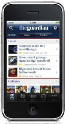
In those days there was nothing else like it – we were way ahead of the curve. Modern UI, easy to navigate: what a fun way to consume our award-winning journalism. It was an instant success.
Over the following year we kept improving it, adding new features, making it better. Then in January 2011 we released the Guardian iPhone app 2.0. With 2.0, we kept building on top of the fantastic UI users loved, making it more intuitive and letting the editorial voice be heard louder than ever.
Engineering wise, the next two and a half years were quite busy.
Version 2.0 was now backed by a much-improved dedicated backend using the same APIs which feed content to the Guardian website. The app became a subscription-based product.

We also added a lot of new functionality and features including push notifications, goal alerts, Twitter and Facebook integration, offline reading experience, rich article styling, US and Australian editions, commenting and much more. In 2013 we switched to a free ad-supported model with a subscription premium tier.
During that time, we also took the app through several OS updates from iPhone OS 3.0 to iOS 6.0 and from classic 3.5 inch screens to 4 inch screens.
The next generation
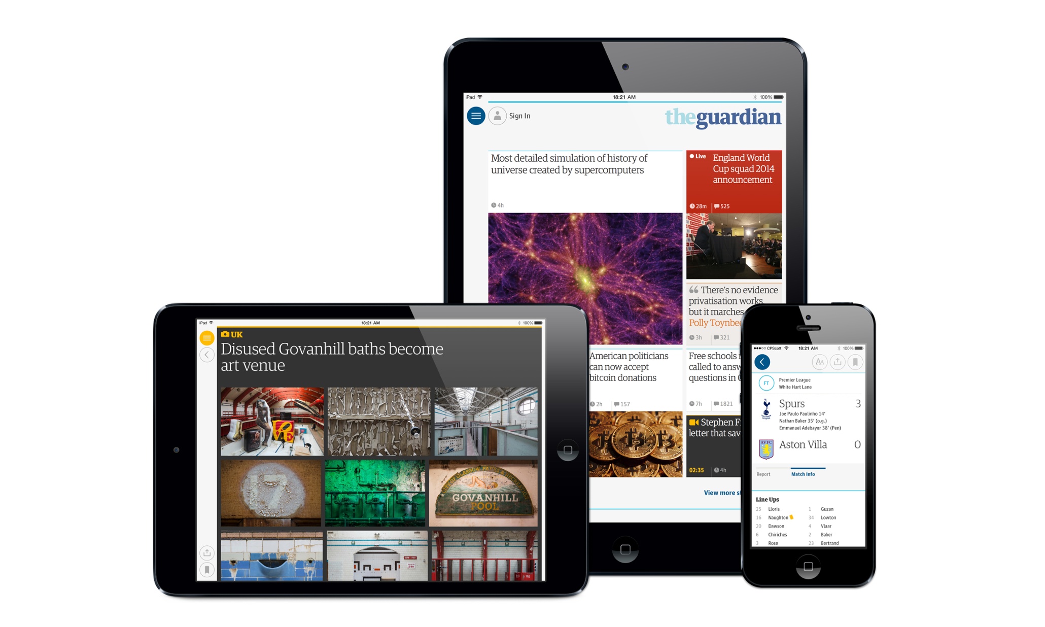
Late in 2012, a small group of us started planning and laying foundations for what would later become 3.0, the next generation of the Guardian news app. Right from the beginning it was clear that we needed to do things differently – the old app’s data models and architecture were just not going to cut it. We wanted to make the app a personal experience: we wanted to put the content front and centre, make it up-to-date and instantly available, any time, the whole time.
After some careful consideration, we made a decision to build it from the ground up. Time and resources were precious and the baggage of the existing codebase was just too heavy. In the fast moving world of mobile software engineering, it doesn’t pay off to dwell on the old for too long.
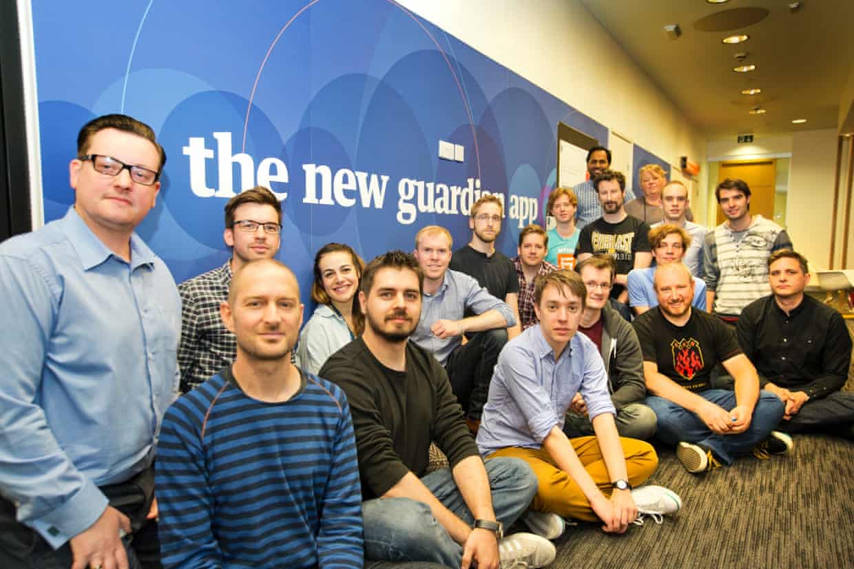
In summer 2013, iOS 7 was released and the UI was radically different. This came at exactly the right time for us: we wanted to start the engineering work as an iOS 7.0+ only app. A few months later and after two dozen heated discussions with stakeholders (who initially considered the whole approach too risky), we got the thumbs up. Piece of cake. Later that year, the team grew significantly – the engineering was in full swing.
Engineering version 3.0
Since we were starting from scratch, we were free to make decisions about how to architect the whole project.
Build types
We came up with four distinct build types: Debug, Debug QA, Beta and Release.
- Debug: a build for daily development with debug menus, logging and various development tools linked in
- Debug QA: a build for our QA team with some tweaks to enable them to QA effectively
- Beta: a build signed by our enterprise provisioning profile for internal company employees
- Release: a build for App Store distribution
Then we created a schema and configuration for each of these build types and pulled all project settings for each into its own xcconfig file, with additional shared xcconfig with common parameters imported into each individual one. By now, the main project file had only default parameters – everything non-default was in the config files. This allowed us to easily manage multiple build types and make global as well as per-build-type changes, all in simple and easy to read plain text config files. Even the project Info.plist is mostly full of variables that are populated from the config files – this way we can have just one Info.plist that works for all build types. This works really well – you just have to be careful with git merges.
We also gave each build type its own Bundle ID and icon so that we can run them in parallel and easily differentiate one from another.

Internal and third party libraries
Version 3.0 is supported by many APIs developed by our internal teams, MAPI being the main one. MAPI serves the content to the app in the most efficient way and works as a proxy between the app and lower level APIs which, from time to time, implement breaking changes. Then we also have APIs for image processing, push notifications, sign-in, commenting, in-app purchase, print subscription validation, and a few other features.
For each API we built an Objective-C static library to abstract the implementation details and make the integration into any app as easy as possible. We also contracted a third party to give us a hand with the crosswords and GuardianWitness modules. To help with networking, logging, analytics, crash reporting, etc. we use some well-known third party libraries.
One of the great things about static libraries is that we can easily link only those we want with specific build types. This way, the Release build stays clean and the binary size is as small as possible.
Pre and post build scripts
Our pre and post build scripts perform some vital checks and changes.
The pre-build script checks that certain features like in-app debug menus, debug logging and development environment parameters are not enabled in the Release build.
The post-build script collects information like commit hashes from all relevant git repositories, generates a unique incremental build number and stores that in the final Info.plist file. This allows us to easily display all information we need to identify the exact commit hashes that were used to produce any binary. It also prepares and bundles some additional resources like HTML/CSS snippets, generates an appropriate app icon for selected build type with the build number written on top of it and performs string checks on the final binary for forbidden symbols (for example, it looks for some of our tools that are only meant for development, but might have been accidentally linked to the Release binary).
Beta build
Our beta builds are signed for enterprise distribution so that we can deploy them internally within the organisation without any restriction. They are built to automatically expire one month from assembly date. This not only helps to minimize the impact of leaks, but also encourages the staff to update to the latest beta builds. Each beta build gets published onto one of our internal servers. At the start, the app checks for the latest version and offers in-app over-the-air update, if necessary. This allows us to distribute the updates instantly to all employees that participate in the beta program. To get a decent coverage and some meaningful data out of your beta, you really have to remove as many barriers as you can and make it a seamless experience.

Continuous integration
Over the years we played with a few CI systems – most tend to be quite heavy on the setup side and require a fair amount of work to maintain. Out of the box, they don’t play very nicely with Xcode. Thinking of all those days wasted trying to fix something that breaks with every Xcode update and every time you need to update a provisioning profile makes me want to cry. Don’t even get me started with trying to make the UIAutomation work through CI.
With OS X Mavericks, Apple released a new version of the Server app with a CI server built in. It’s rather simplistic and was quite buggy initially, but once Apple resolved a few issues, it became pretty stable. The best things about it is seamless Xcode integration, virtually no maintenance and the fact that it’s super simple to set up. In fact, you can buy yourself a Mac Mini and have the CI up and running with your project in a matter of hours… and that includes running down to the Apple Store and buying new Mac Mini.
Web views
Now don’t get the wrong idea here, the app is fully native, carefully crafted in Objective-C with love. With the article screens though, we were in a bit of a pickle. The content we get from APIs is HTML formatted, often very rich with styling, embedded images, audio, videos, tweets, even embedded JavaScript interactives. We get the same content that goes to the Guardian website, after all. The editorial staff format and layout the content in certain ways and the text wouldn’t necessarily make always sense without the rich elements in their original locations. We wouldn’t want to take them away from the reader anyway.
That’s why we made a decision to have the individual article screens as web views. Although that solves the problem of rich formatting, it brings a whole host of new problems too – the initial load speed and the lack of control over rendering being the main ones. These issues can be solved, to some degree, by clever HTML, CSS and JavaScript combined with delayed loading for less important or off-screen elements.
Templating
Since the article screens are essentially web views, we created HTML templates that would wrap around the rich article body content. The APIs give us only the HTML for the article body so the templates themselves are bundled with the app. We also saw an opportunity here – we have a separate remote templates location which allows us to deploy updated templates very quickly to all app users without the need to release an updated version of the app itself. The app checks for any template updates and downloads, validates and deploys them automatically, if necessary. Powerful stuff: it gives us the ability to fix many potential article rendering issues instantly, globally, even for older app versions.
Custom fonts
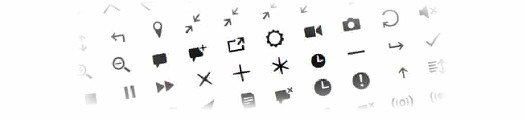
We use custom fonts throughout the app – they are a huge part of the Guardian’s identity. In addition to Guardian fonts used for text, we developed a special font for all the symbols and iconography you can see in the app. This allows us to keep the app bundle small in size, as there are almost no images, but more importantly, we can easily tweak the symbol positioning and sizing between platforms (iPhone vs. iPad), and even dynamically depending on the content surrounding it.
Caching
We see the content availability as the most important part of the app – it’s a news app, after all. That’s why we designed it with offline capabilities at its very core and developed a custom caching engine. We cache everything on the device up to a certain size of the cache – when the limit is reached we can then make a smart decision about what needs to come out first. It doesn’t have to necessarily be the first-in-first-out strategy – we can decide to eject hi-res images first and keep the low-res ones around for a bit longer. We can favour article content over attached images; favour more frequently visited sections over less visited ones; the possibilities are endless and it’s something that we’ll continue to adjust until we feel it’s exactly right.
Update instead of a separate app
With such a major redesign we considered two options: should we release 3.0 as an app update to all existing users, or as a new, separate app? There are pros and cons with both options. When version 2.0 was released, it was a separate app rather than an update. On one hand, users had to find the new app in the App Store. On the other, they were able to run both apps in parallel for some time. Over the years, though, supporting both apps and running the backend APIs for both became a major headache, and an expensive one too. With 3.0 we also needed to consider subscriber migration: there’s simply no easy way to do it if your new version is a separate app. Releasing 3.0 as an update to all existing users allows us to look forward into the future instead of looking back and dividing our attention and resources on supporting the past. Ultimately, it’s the user who benefits.
The future
So that’s how we approached the engineering of the Guardian news app 3.0, developed in collaboration with you, the Guardian reader, backed by five years of experience in designing and engineering news apps. In case you haven’t installed the app already, go to the App Store and download it to your iPhone or iPad for free.
We also made a short video with a voiceover by the brilliant Robert Llewellyn.
For us at the Guardian, this is just the beginning of a new chapter. Get ready for many more great things in the coming months and years.
In the words of Ace Rimmer: Smoke me a kipper, we’ll be back for breakfast.