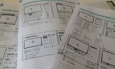
We launched a new video page last week here at the Guardian, which was the result of a lot of work by the Core team, who work on features relating to guardian.co.uk. We had a number of design and user experience goals, which we’ll explore in this post.
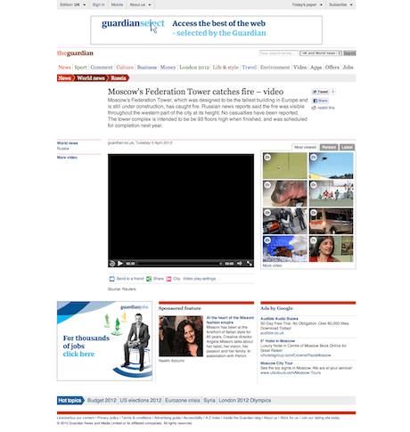
One of the key aims was to make the video more prominent. It sounds obvious (“it’s a video page!”), but in the old design, the first thing presented to the user was a standfirst – a paragraph of text describing the content of the video. Whilst the standfirst is good for SEO and is generally useful, this text is not as compelling as the actual video. It also had the unfortunate side effect of pushing the video far down the page, forcing the user to scroll in order to actually see the video. The video player was relatively small – 480px wide – something that frustrated us, and didn’t allow our great content to shine. It’s now much larger.
The final design puts the larger video player top and left, and a new video carousel immediately to the right. The carousel automatically shows videos from the same series as the current video, and falls back to automatically-generated related videos if no series is found. We rationalised that if a user is currently browsing content in a series, they’d rather engage in the series’ videos and not simply related videos. As part of the project, we have also introduced an ‘endslate’, which displays the most popular videos at the time of watching.
Another goal (and challenge) was to better manage and deal with the number of elements that may – or may not – be present on a page. This list includes (deep breath): story packages, factboxes, series links, links to other content, badges, warnings, comments and advertising components. Any design that was taken to implementation needed flexibility to accommodate all of these variations, and still provide a positive user experience that is actually implementable. Arguably, we’ve achieved that with the design that’s live, or at least we’ve managed to accommodate all of the additional elements without causing the page to look disjointed when additional elements are present.
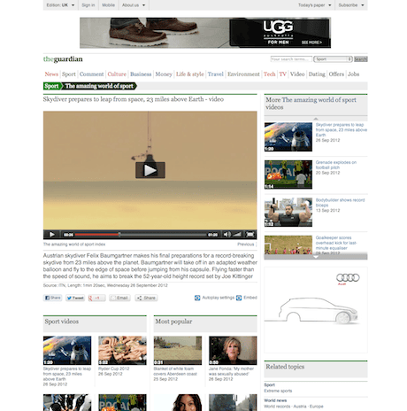
The previous version of the page had tabs representing Series, Most popular, Recent and Related. We’ve now removed the tabs and placed the additional content in two columns below. The reason? Our data indicated that few users were clicking on the tabs. It’s great to give a choice of content, but when the added complexity of tabs wasn’t being utilised, it didn’t seem prudent to carry that into a future design.
A lot of these decisions have been informed using data, either from our analytics, or through A/B testing. We ran a number of A/B tests to see what we could learn from the old design while we were designing the new page. A simple yet obvious test was putting the title below the video: that netted us an additional 15% clickthrough rate on videos. We also learned that making the Recent tab default (as opposed to Related) resulted in a 44% decrease in clickthroughs.
Needless to say, these results only stand in the perspective of the Guardian, as these behaviours are so contextual and specific to our use case, and we’ll also need to revisit them in light of the new design. We’re keeping a close eye on performance, and often run additional tests to generate smaller gains in clickthrough and interaction. Individually these gains don’t add up to much (maybe 1-2%), but taken cumulatively, they do.
Lessons learned? Things we might have done differently? I would have liked the process to be more agile, with more frequent iterative deliveries working towards a “final” design (when are designs ever finished?). We also recognised that two layouts would have been appropriate for our content: one for a more engaging, editorial high-quality videos; another for viral videos where size isn’t always important, but where onward journeys and discoverability of other content is.
The major lesson learned for all of us on this project was that the previous design really didn’t sell the video experience, and hopefully we have a strong base from which to refine what we’ve got.