Here at the Guardian, we think a lot about timelines.
Timelines remain one of the most useful visual mechanics to display sequenced information. They also, as we have been discovering, relate very closely to that other “visual mechanic” of our time - the stream, which, thanks to Facebook and Twitter, is emerging one of the pre-dominant, if not the dominant, metaphors for news distribution in the digital era.
So when the opportunity arose to create a “Second Screen” experience for the Olympics, which would have to display the huge variety of Olympics-related news: from blog posts, to tweets, pictures, and other data-based updates (results, medal tables, and the like), we wondered: was there a way to reimagine the timeline such that it enabled a better navigation of this voluminous stream?
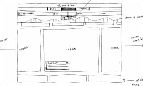
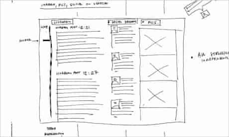
Early sketches
We toyed around a lot with the issue of horizontal versus vertical scrolling. (Chris Pearson, our lead designer, drew more preliminary sketches than he’d care to remember.)
There are compelling arguments in favour of vertical scroll, not least because social networks have made vertically-scrolling streams familiar.
For us the decisive factor was the need to add a timeline - a second component: would it scroll vertically too, alongside the main window? Or would it scroll horizontally, above?
Ultimately, neither approach seemed quite right, particularly in light of the fact that our primary use case was a ‘second screen’, namely an experience you have on tablet. (Had we been building purely for mobile, that might have changed things.)
We also experimented with different approaches to the basic display: should we break out the streams (blogs, photos, tweets, results), showing many across the screen at once - as with this early sketch (above) and prototype?
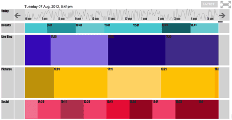
The consensus was that having multiple streams would introduce unnecessary complexity. Better to retain a single focus at any one time, send the message: “This is the one thing you should be looking at in this moment”. If readers wanted to navigate between streams - turn them on and off etc. - we could let them do that with filters. (More on filters later.)
The timeline as index
Easily the greatest interaction design challenge was the timeline. Most timelines which display content put the content on the timeline, at the point which corresponds with the content’s timestamp. (This event took place at 12:52pm, so we’ll place it “at 12:52” on the line.)
The seems self-evident - unavoidable, perhaps, at first glance - but the challenge this presents from a design point of view is clustering: what happens when lots of events take place at the same time? (They bunch up, is the answer. Often inelegantly.)
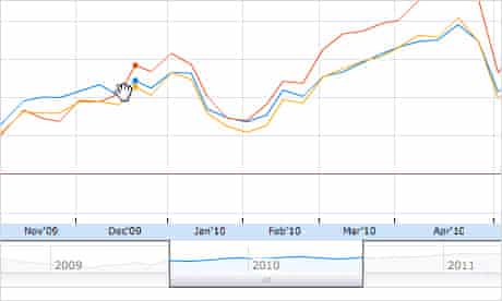
Most interfaces handle this problem by introducing a zoom mechanic. Google Finance is a well-studied example - it puts sliders on a horizontal axis that allow the user to change the focal length of the main display.
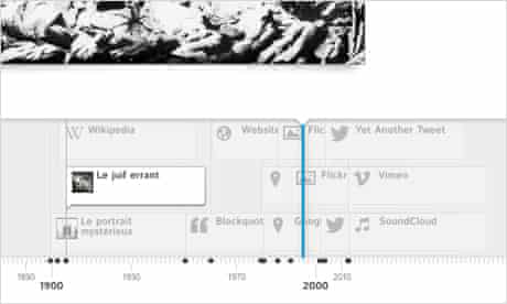
We were also impressed by the beauty of Timeline JS, which has a more traditional “map-like” zoom.
We couldn’t help feeling, however, that zooming seemed to introduce an annoying “bit of interface” that had to sit in between readers and our content. (Who wants to zoom in on a timeline?) What if, instead, you kept the timeline and the content display separate, and used the timeline as an index onto the content. Bringing 12:52 into focus on the timeline - with a tap, or by dragging the timeline there - would instead involve the front end asking the back end for the bit of content nearest in time to 12:52, which would in turn be served up.
Our front end developer David Vella teamed up with Ken Lim, who ran the back end, to make this happen.
This begged another question, namely: what would the timeline display, if not the content itself? The answer came: how about a measure of interesting-ness? How about something - some data, say - alerting a user that “something interesting” happened at this point? This seemed to have potential. But what would the data be?
Enter Twitter. With the help of our collaborator Alex Voss, from the University of St Andrews, and colleagues from the Analysing Social Media Collaboraton, we put together an engine which mined Twitter for all Olympics-related tweets, giving us a data point which we could use as the basis of “Olympics-related activity”. We could thus create a data-driven display which not only charted “interestingness” but could, as a result, act as a way of navigating and browsing the timeline.
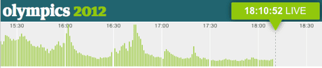
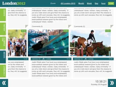
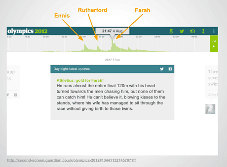
It paid off, we hope. Look at this grab from Super Saturday - the day Jessica Ennis, Greg Rutherford, and Mo Farah won gold. The tool was working the way we hoped it would.
Other design touches
Other pieces started to fall into place at this point.
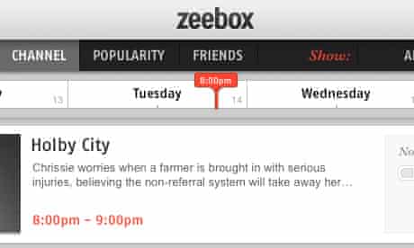
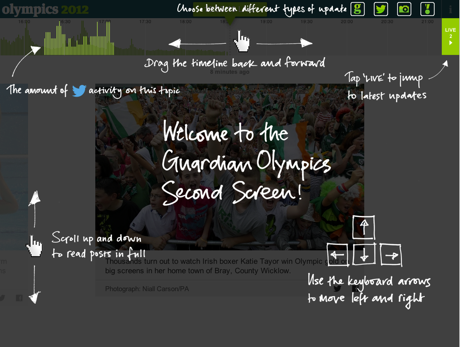
With a nod to Zeebox, we decided to have a marker top and centre which always displays “where you are”; moving between times would thus involve dragging the whole timeline or tapping a particular point in time to snap to that point.
“Content type filters” - which would allow users to turn photos on, turn tweets off, etc. - began life in a drop-down …

… but user-testing during Euro 2012 and the Tour de France suggested no one was using them, so we brought them out as standalone features in the top bar, which seemed simpler.

This was also in keeping with the style of other Guardian apps, such as Eyewitness.
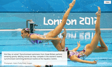
“Tap pictures for full screen view” was a relatively late feature, though in retrospect it’s amazing it wasn’t higher up the list.
(It’s been one of the most popular features.)
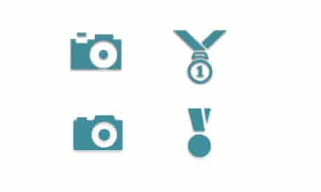
There were many other aspects of the design which required finessing. Icons were finetuned. (Thanks, Mark McCormick.)
We also had a big dilemma with the approach to different font sizes - so text could be more compelling depending on the length of update it represented. (A tweet should be more emphatic, and larger. A blog post would require a more zoomed out approach.)
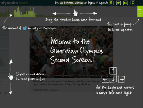
Finally, there was also a spirited internal - and external (via Twitter )- debate about the merits of an orientation page. Our UX team were sceptical. In the end we decided that a simple, unobtrusive one-pager would serve not only to explain a few simple features of the app but also, by virtue of a lovely hand-written font (thank you, Sarah Habershon), give the experience a friendly, relaxed tone.
That’s about it. We hope you enjoyed using the Second Screen as much as we enjoyed building it As ever, we’d love to hear what you think.