We’re releasing an update to the mobile site that we hope gives you a better selection of articles, videos and galleries when you visit our homepage. We’re rolling this change out gradually to visitors over the coming weeks.
You will still find News, Sport and Features at the top of the page but for the rest of the page we’ve created a few new categories.
To give more depth to our biggest news stories, we are displaying supporting links to articles where relevant.
Most popular, which was at the bottom has been pulled further up the page as we know this is something that a large proportion of visitors click on.
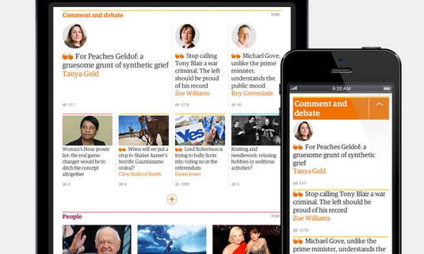
We are introducing ‘Comment and debate’, ‘People’ and ‘In pictures’ categories.
Why have we made this change?
We’d like to surface a wider range of our journalism. With this first step we’re organising our stories differently on our homepage with our readers in mind, rather than simply presenting the latest from each section of the website.
Of course, all the section pages still exist, so if you regularly visit us to find out what’s happening on Comment is free, Culture, Life & Style, Tech, Money or Travel, you can see all the latest material we create by visiting those pages directly.
What’s next?
We will be adding more collections to the front page and to all the section pages as the website progresses. Our aim is to build a site that presents all the journalism you’re looking for in the best way across mobile, tablet and desktop.