Reading your reactions to our World Cup 2010 Twitter replay visualization made me smile. There’s no better affirmation for a web project than seeing it reach people around the world. With readers of every competing nation taking an interest, I thought it might be worth describing how we put it together. As with football, teamwork is everything.
The project kicked off a few months ago with a simple but challenging brief: “Can we make a distinct and engaging representation of Twitter activity during the World Cup?”
The last few years have seen some fantastic Twitter visualizations using all sorts of approaches. Standing out would be difficult. That said, whilst many of these are great fun, only a few convey a sense of context or capture the spirit of popular occasions. Looking at these precedents it became clear that two key problems must be overcome. One, the tide of Twitter activity needed to be stored and made sense of throughout the tournament. Two, the resultant data should be presented without losing the energy of each tweet it was made up from.
I pondered all this on holiday and returned with a plan. A system that samples the shifting popularity of words could record and relay data to an app that animates these changes over time. With this approach, we could create the data-driven equivalent of a fast action replay for every game in the tournament. If we got it right, people might see the roar of the crowd passing through Twitter.
The first step in making this happen was enlisting the help of our Java team. In order to capture and analyse tweets minute-by-minute throughout the cup, Francis Rhys-Jones got to grips with the Twitter API and started putting together a web app. At root, a scheduling system slurps relevant tweets and adds them to a full-text index. A further task calculates the twenty most popular words every minute and stores the results. Finally, a REST service enumerates this data in JSON format for a required window in time.
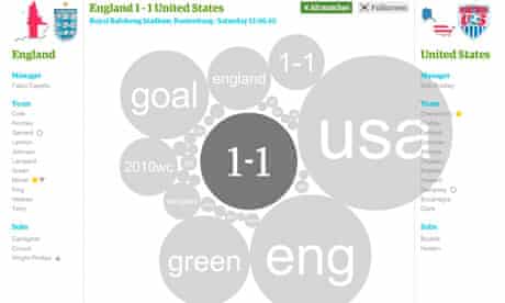
The next challenge was in some ways the most critical. Having collected the data, how could we represent it in a distinct and engaging manner? My original sketch had several problems. It relied upon being able to assign every word of every tweet to a specific team. It supplied little context about what was happening in the game. It involved the dynamic layout of a list of words whose sizes and positions were constantly changing. Fortunately, our graphics team were on hand to help sort things out. After some wise words from Paddy Allen and Michael Robinson, Mark McCormick strolled up to the whiteboard and drew the first version of our expanding bubble layout. By placing the bubbles around a central hub containing the score, he solved two problems at once. Nice. As these graphics progressed, country and timeline information were incorporated to enhance the narrative pull. Finally, Andy Brockie and the editorial design team tweaked the fonts and colours to keep things consistent with the rest of our World Cup coverage.
As ever, having some graphics in place really got things moving. We swiftly realized our next problem – the team info and timeline panels in the design required data to feed them. Our football mad product manager, Alex Liesche, had the solution: a large number of our existent match and tournament pages on the site are generated from feeds provided by ESA. Once a match is completed, they provide a full summary of teams fielded and major game events like goals, cards and corners. The Java guys then coaxed the requisite tournament data into a single summary and the stage was set.
The biggest job throughout this process fell to one man. Martin Shuttleworth is a fantastic Flash developer who I’ve worked with a number of times in the past. Once the designs were ready and the various data feeds agreed, we sat down and discussed how the interactive itself would work. On start up, the appropriate data would be loaded and assembled to model the tournament. A match browser would enable any completed game to be selected for replay. Once the game summary was loaded, the appropriate time window would be calculated and a call made to the word popularity API. With all the data in place, the main view could be built and the match replay started. Data flow would be controlled from an interactive timeline representing the match duration in the same way a video scrubber might. Replay would whizz through at sixty times real speed, so 90 minutes could be watched in 90 seconds. Users would have the freedom to pause, rewind or jump to a specific moment in time. At the heart of all this we have a series of data frames, each one describing the 20 most popular words for a specific minute in time. Each frame could be represented graphically as a series of bubbles sized according to word popularity. Transitioning from one minute to another would be a question of animating the change from one state to the next.
At this point, I should probably mention where the real magic lies. If you’ve ever watched someone drawing a packed circle layout by hand, you’ll know it takes some time. The circles must all be sized according to their relative values but never overlap. Our code would need to make these calculations more or less in realtime. Word popularity could vary drastically from one minute to the next, particularly if a user was jumping around the timeline at will. The solution, I knew, would involve a physics engine. Box2D has a great pedigree, having started off as a C library for games programming. Furthermore, AVM2 is reasonably fast when executing mathematical calculations. Still, keeping our balls in order was going to be a big challenge. To my mind, Martin not only solved this problem, he managed to solve it so that the animation feels right. In lesser hands, the explosions of activity surrounding each goal might have become a swollen mess. Hats off to Mr Shuttleworth.
To recap: we started by figuring out how to collect aggregate stats from Twitter, produced an initial design for representing this data graphically, pulled together some supplementary feeds of match and team information and then started to build an interactive that uses a physics engine to help render animated replays of the changes in word popularity over time. What else could possibly be required? As always, the devil was in the detail. Once we started to work with the ESA feeds, we discovered that they didn’t include all the information we needed. Most crucially, they provided no accurate indication of when matches were finished or how penalty shootouts unfolded. Thankfully, our ever helpful Central production and sport teams came to the rescue. Paul Torpey and the sport team undertook to maintain a number of Google Docs that would fill in all the gaps in the ESA data. One should never underestimate the importance of this kind of manual intervention. With the project running to such a tight deadline, we would have been hard pressed to get things done otherwise.
Two final challenges emerged just as we were preparing to go live. On one hand, I delved into the depths of Flash’s Date object to ensure that everything would work in every possible timezone. On the other, we’d decided to allow deep linking of individual games using swfaddress. This isn’t a standard feature of our interactive pages and we weren’t due to release a new version of the main site code for at least another week. Kudos in this case goes to dev team stalwarts Grant Klopper and Tony McCrae who incorporated the appropriate JavaScript file through a little known back door. One last round of tweaks later, we had a build of the interactive ready for launch.
So there it is – the story of one of our more ambitious interactives. To conclude this tale, I must also express thanks to Sean Clarke and Igor Clark, whose ever valiant cat herding was vital in getting much of this done, and Giles Anderton who kept the balls rolling whilst I was off sick. As all Beach Boys fans are aware, you need a mess of help to stand alone.