Today is the third full day of our Discovery Week project, so without further ado, here’s a summary of the past 24 hours as the Guardian’s various departments, teams and external contributors get together to dream up the next phase of the Guardian’s digital future. You can read about what one project got up to in our Day One diary.
After a day of planning and brainstorming, the real work was properly underway by Tuesday. Day two saw a couple of milestones: our first of two user testing sessions, and the first of many show-and-tell meetings for other staff.
The user testing sessions, chaired by our User Experience Research Lead, Craig Spencer, consisted of real live people who use Guardian digital products, giving their feedback and sitting patiently through a barrage of questions and slideshows representing our early-stage ideas and concepts. This was both informative and intimidating: presenting our ideas at the end of the week will be tough enough, but showing them to external people after just a day’s worth of work is a real challenge. These sessions give us the opportunity to test ideas and make sure we’re putting our readers and users at the start of our ideas.
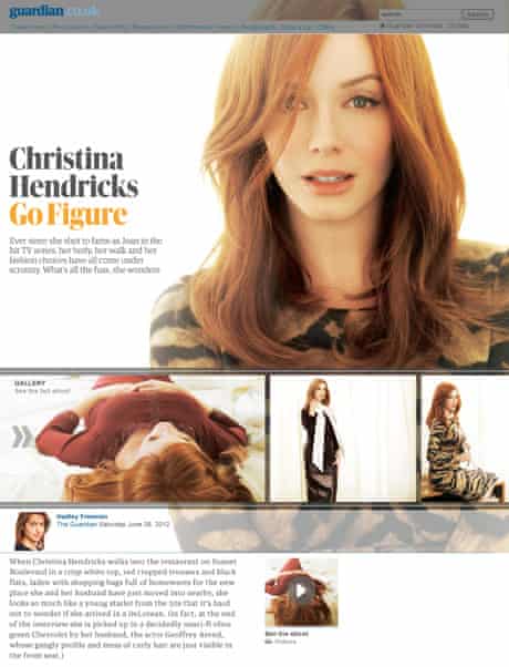
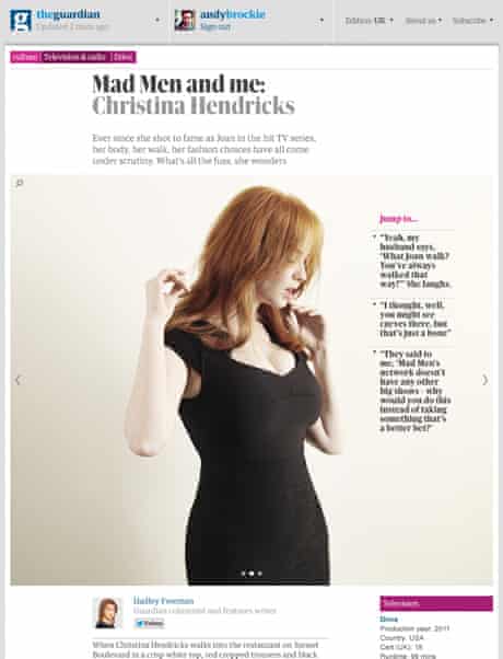
At the end of the day it was time to demo the works-in-progress to a packed morning conference room full of people from around the business. First up was a team representing the Visual Design theme (one of five themes of the projects). Senior Designer Andy Brockie demoed the re-imagined views of feature content as Guardian Weekend editor Merope Mills talked through the design decisions and the options to refocus content where articles were heavily image driven, perhaps attracting unfair attention by demonstrating their ideas using pictures of Christina Hendricks.
They also talked about their plans to do similarly visual treatments for less image-heavy content, with some nice designs featuring strong typographic treatment in place of images.
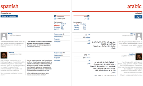
Up later was client-side developer David Vella, talking about a couple of related projects under the umbrella name “the Polyglot Guardian”, all centred around translation. David presented a demo of Ivan Codesido’s project, a tool which allowed readers to automatically look up definitions for words on the fly, inspired by mobile and tablets in-built dictionary functionality. David then presented his own project, “BabelDiscussion”, an ambitious tool which added a dropdown language selection tool to user comment threads, allowing users to read comments in their own language, as well as see the original text alongside the translation.
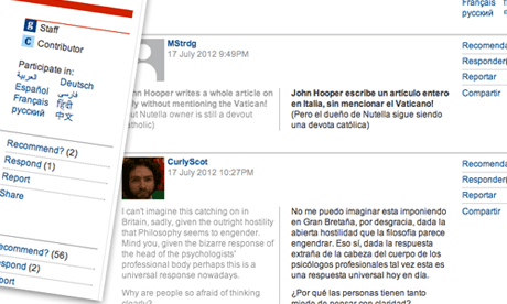
David adds: “The project is an attempt at lowering the language barrier in our discussions by enabling readers coming from different cultures to contribute in their own native language. Messages are automatically translated back and forth between the languages. In order to keep the process as open and transparent as possible, we always show the original message exactly as it was written, alongside the translated version.” Here’s another screenshot, showing the right-to-left text used for the Arabic translations:
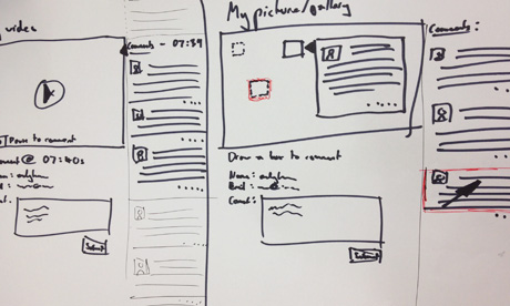
Hannah Waldram presented a really interesting concept she worked on alongside designer James Kynvin and software architect Andy Hume called “Setting Comments Free”. Here’s their premise:
“What happens when you free comments from their ‘below the line’ restraints and start thinking about ways to attach conversations to the particular parts of the story they are about? As part of discovery week community coordinator Hannah Waldram has been thinking about the implications of ‘setting comments free’ to make conversations on site more discoverable and easier to navigate on the page. With a robust team of editorial experts in commenting, Hannah and Guardian developers and designers started the week by thinking about the barriers to entry for those who don’t comment on guardian.co.uk. ”
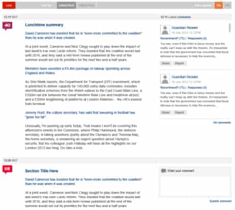
Hannah continues: “From user testing session it became apparent that allowing users to comment on certain parts of the story, or parts of the page, might free up comments from their dungeonous placement below the article, and allow new users to see where interesting conversations and debates were taking place. More importantly moving comments up to a level-pegging with reporters words might show the true value we put on our readers’ contributions. For other media like audio,video and pictures, time-stamped comments have worked well (such as SoundCloud’s commenting system), but noone seems to have cracked it for the bog-standard article page. ”
Hannah talked about some problems facing the project: how does this change the reading experience and content flow, and how to ensure the comments placed alongside editorial content were of the best quality? There was also discussion of a user tagging system for comments which might help surface the most relevant and interesting discussions alongside articles.
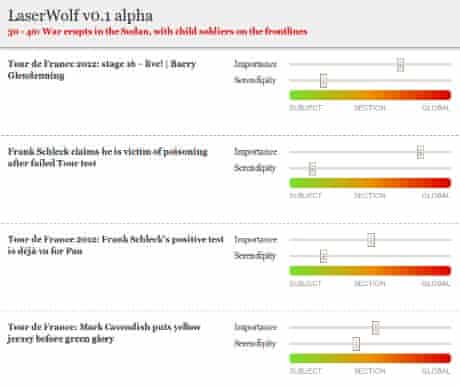
Finally, for my own PROJECT LASERWOLF (capitals mandatory), we managed to knock up a basic end-to-end demo, meaning that the admin screen shown below now outputs data in the form of a JSON API which can then be consumed by multiple devices/platforms to produce a list of stories ordered by editorial importance, plus an optional “serendipity” weighting. We’re still experimenting with the numbers and the interface, but we’re hoping to have a few different frontends to this data to demo for our own show-and-tell session this evening.
There’ll be more coming up as the week progresses, including an update from this evening’s show-and-tell session, as we approach Thursday’s last full day of hacking before presentations begin.