
I work as a client-side developer at the Guardian, and until recently I was a member of the Subscriptions team. The focus of my team was to encourage readers to support us through digital subscriptions.
At the Guardian we believe in keeping quality journalism free and open for all. This means we need to highlight clearly to our readers why supporting us through a digital subscription is a good thing to do and present the benefits to them.
Through user experience research we tested ways to explain the benefits of a digital subscription and narrowed down the best ideas. We then tested those ideas alongside our own assumptions using A/B tests.
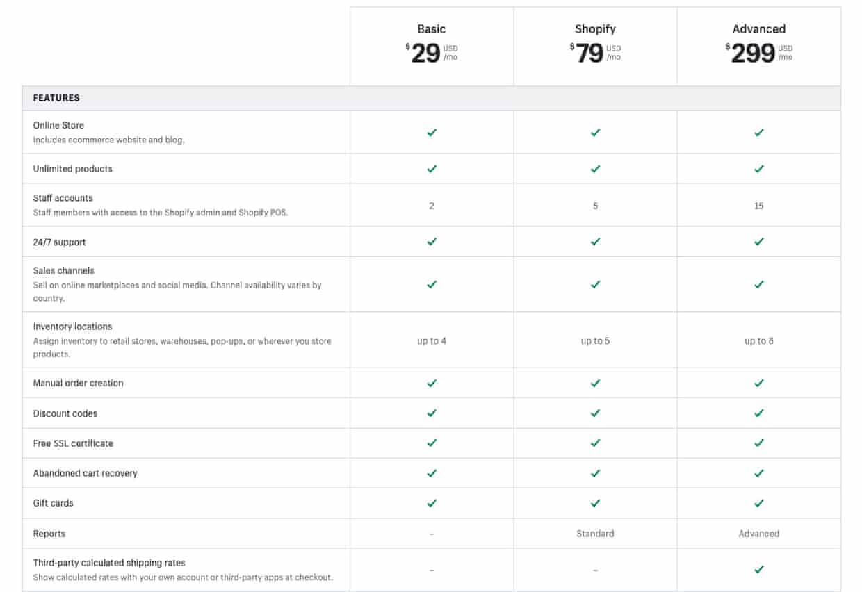
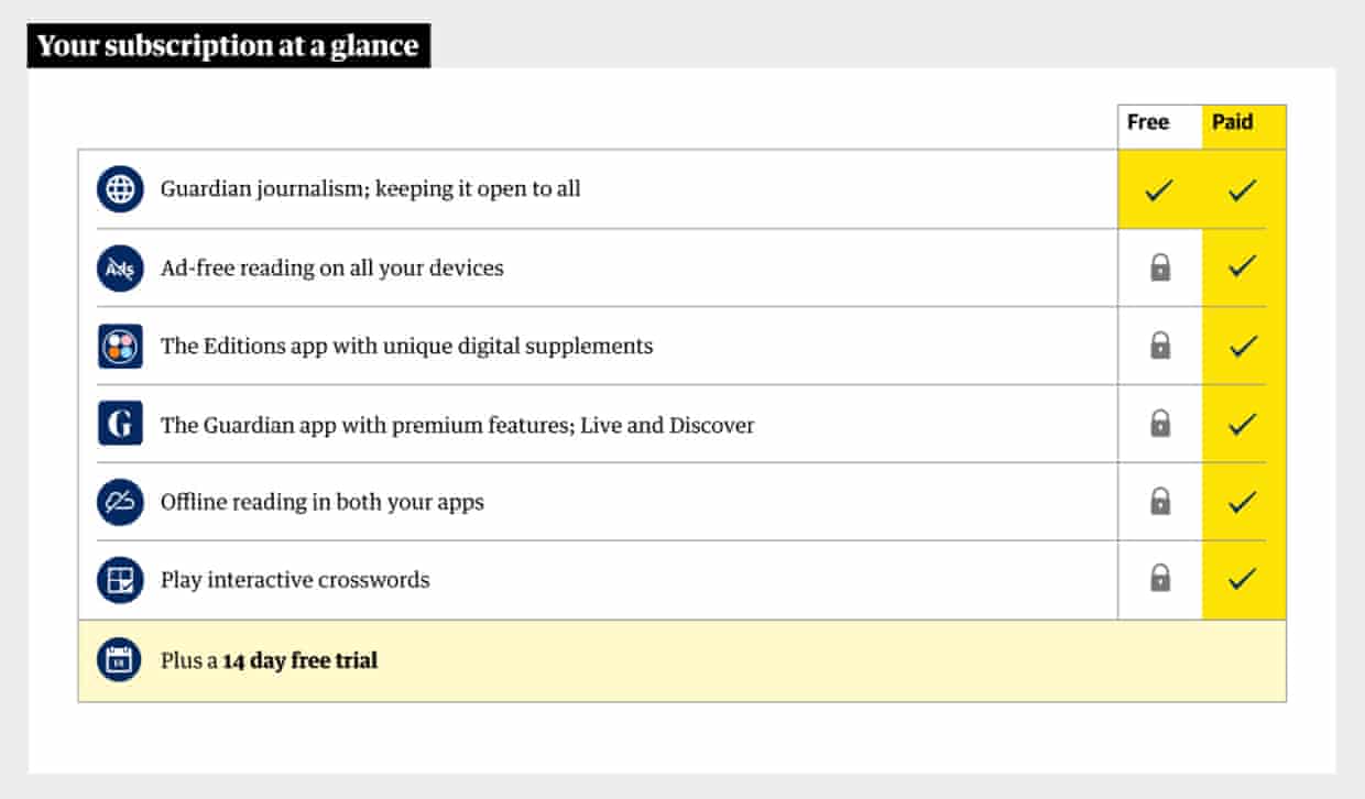
One idea that resonated most with our research participants was a comparison table. A comparison table allows readers to scan a series of product options, and tell them at a glance what they include. Something a bit like the table below, which compares the features of a series of products offered by Shopify:
I was the developer to pick up the task of making the comparison table component for an A/B test. The component felt well within my skill set – a UI component with non-dynamic contents – so I figured building it would be a cinch. I worked quickly, relying on tools in my comfort zone, like flexbox. In my mind, tables were deprecated (spoiler: they’re not), so I shunned them in favour of a list, thinking to myself that from a screen reader’s perspective, the content was pretty much a list.
My first inflection point was when I opened the page in Safari – one of my early confidence checks to ensure my code works in the browsers we support. Sure enough, it was broken. I sighed, figuring that flexbox was the likely issue. I decided it was time to be brave, and opened the CSS grid cheat sheet that I had bookmarked. Implementing CSS grid-columns turned out to be simple. It just worked.
It was at around this point that I started wondering about accessible tables best practice, and after reading ally-101, I realised that tables are not in fact deprecated – not at all. If you are trying to make a data table, this is definitely the correct semantic HTML to use. So I sheepishly removed
- and replaced it with and swapped
- for . As the article suggested, I used scope=”column” and scope=”row” to demarcate column and row headings, and I added a visually hidden
-
Don’t retro-fit accessibility: think about how to make your code accessible up front.
-
If you’re trying to make a data table, use
-
If you use
-
This is the big one: don’t create a separate or different experience for people using assistive technology. People using screen readers can navigate and understand tables if we provide the correct HTML, attributes, and labels.
-
Read the instructions.
Development of digital products is central to the Guardian. You could be building the products that showcase our progressive and independent journalism, crafting the tools that journalists use to write their stories, developing the services that allow those stories to be distributed across the globe, or safeguarding our financial future.
If you’re interested in joining our product and engineering team, please visit the Guardian News & Media careers page.